Dive Brief:
- CVS is in the midst of rolling out refreshed packaging designs for its private-label products as it seeks to strengthen store-brand sales and loyalty.
- Consumer research informed simplified front-of-pack designs that more prominently feature the CVS brand. This month, the pharmacy chain has begun selling 68 products using the updated packaging designs, with the full suite of almost 3,000 products spanning more than 20 categories set to follow suit in stores and online throughout 2025 and 2026.
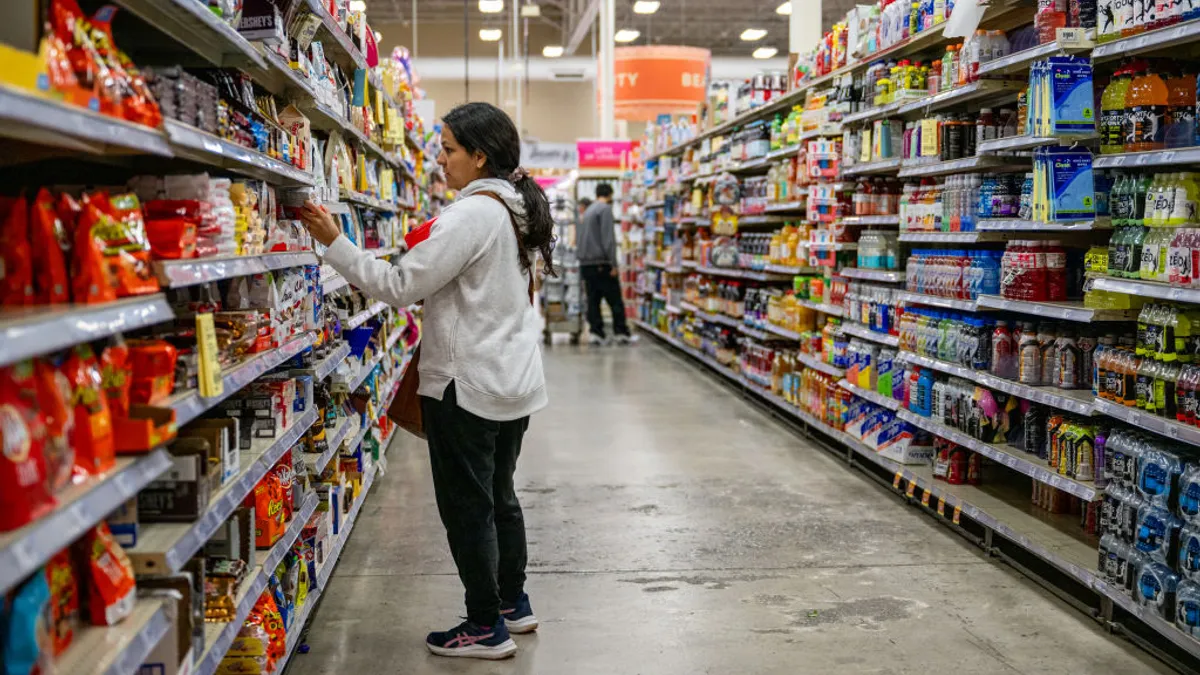
- Store brands, known for their affordability, are relevant as ever for cost-pressured consumers. “We know that that's a continuing opportunity for any retailer. It helps drive loyalty, it helps drive retail differentiation,” said Vice President of Store Brands Mike Weir. “We’re leaning into it.”
Dive Insight:
The process of redesigning what’s printed on CVS brand packaging started over a year ago, Weir said. “The CVS brand and the brand identity hadn't really been retouched in over a decade,” he said, noting opportunities to modernize. “We want to be the most trusted private-label healthcare brand in the market, and doing this redesign helps us move that forward,” as the company considers consumer sentiment and long-term plans for the CVS brand portfolio.
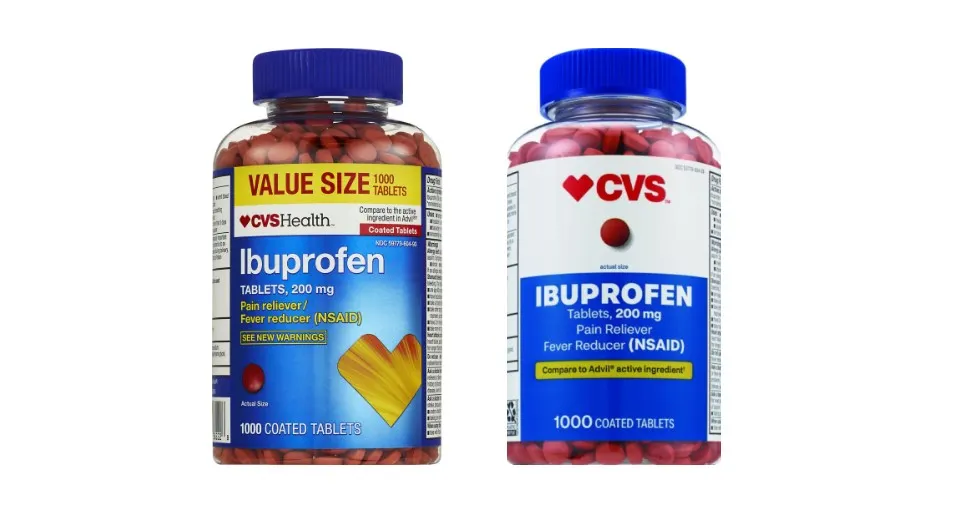
One of the first product areas CVS has transitioned is certain common drugs, namely the “four-foot sections of ibuprofen and acetaminophen, which we know are some of the best categories for the CVS brand in our store.” The idea was, if CVS could methodically get that space right, it could succeed with other product areas too, Weir said. Ideally, this will “help scale for the thousands of other items that are about to come behind it.”
The company started out with many competing design concepts, testing them to see which consumers preferred over the existing design and narrowing down the options. They utilized eye tracking, as well as qualitative and quantitative feedback sessions. Insights from thousands of consumers revealed that there was greater opportunity to amplify the CVS brand, simplify the shopping experience and elevate the perception of product quality, Weir said.
Older designs put the brand and naming conventions a little more in the background, Weir explained: It “didn’t really convey our brand very well, and it didn’t help customers understand what the product was.” The new design aims to simplify the CVS logo.
CVS also moved some left-adjusted designs to leverage the center of the pack. As part of the simplification theme, it also embraced “a bold use of white space that allowed our brand to stand out, and that allowed the products and the product imagery to stand out.”
Further, the team scrutinized the words on the pack, really asking whether each word was needed for the customer to make an informed decision. This resulted in moving some claims from front-of-pack to the side or the back to allow for streamlining the front.
Weir noted that, given all of the different product areas that CVS sells in, it was hard to create a standardized design architecture for thousands of items. As such, the design tenets applied to the ibuprofen packaging, for instance, may differ in other categories such as CVS’ newer Well Market brand for snacks, beverages and groceries
“We’re finding elements to kind of connect them through, but we also want to make sure that they compete in the categories they play in,” he said, and apply to the mindset a customer is in when shopping in a particular category.