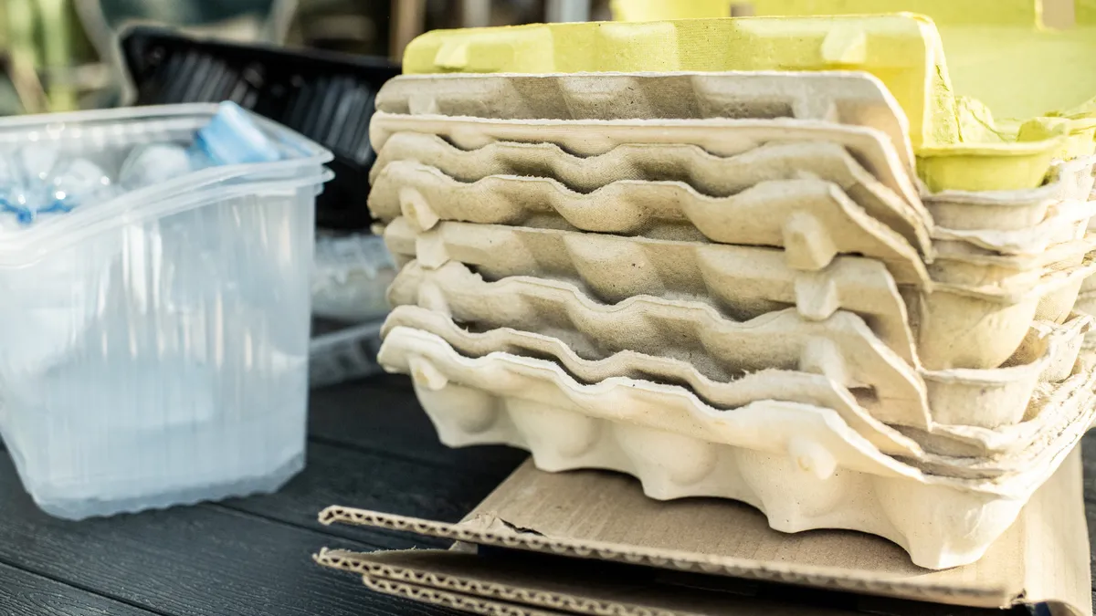
More returnable packaging systems are popping up at event venues and in communities, with funding generated through extended producer responsibility programs also poised to support expansion. As reuse proponents figure out operations, also top of mind is successfully marketing to consumers who are deeply accustomed to linear single-use packaging.
That marketing entails multichannel campaigns and everything down to the color of the packaging itself.
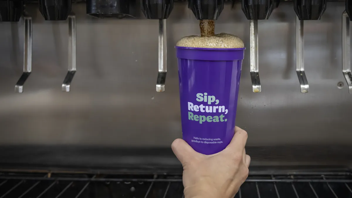
A frequently cited reuse case study in the past year was the months-long Petaluma Reusable Cup Project in California, which was run by the NextGen Consortium under Closed Loop Partners’ Center for the Circular Economy. This effort involved many food service businesses, like restaurant and coffee shop chains, adopting a common set of reusable cups that could be returned at dozens of collection points across the city.
Over three months, some 220,000 cups were returned. Organizers conducted more than 1,000 consumer interviews and surveys to glean takeaways on reuse messaging.
Following that project, Closed Loop Partners noted that the color purple was not widely used in branding or other waste streams — giving it potential for reuse rollouts.
Carolina Lobel, senior director at CLP’s Center for the Circular Economy, further outlined some key lessons related to effectively messaging consumers about reuse programs. “When it comes to reuse, words matter,” Lobel wrote in a blog this week. Reuse operators have the tall task of trying to build new habits: “using and disposing is such an engrained part of our daily lives that asking people to return packaging takes significant cognitive effort,” Lobel said.
In the case of Petaluma, in-store communications and signage “played a disproportionate role in successfully driving awareness, understanding and returns,” Lobel said.
When it comes to messaging, just as important as what’s said is what’s left out, Lobel noted, so as not to overwhelm the consumer. “Consumer communications should prioritize the part of the solution users need to participate in” — the return — “rather than abstract or highly technical ecological benefits,” such as tons of emissions avoided, she explained.
The strategy applied not just to the reusable cups themselves but to the bins they’re returned in. In Petaluma, those bins featured a cup-shaped drop-hole on the bin to try to reinforce that the bins were only to be used for the reusable cups and avoid contamination.
Lobel also credited the initiative’s widely repeated slogan, “sip, return, repeat,” as helping to build recognition among consumers. “The use of clear fonts and bold text is also vital to cementing these new instructions,” she said. “It took time for the chasing arrows to become the universal sign for recycling, and it will take some time for reuse logos to get there too.”
There are already other industry efforts underway to get a clearer, more universal reuse logo into the public conscience and differentiate returnable items from other waste streams.
The Rebrand Reuse design competition, backed by reuse system standards development organization PR3, is meant to spur a recognizable logo for use on reusable packaging and infrastructure that’s distinct from recycling symbols. The jury, which includes design and sustainability professionals from around the world, is now reviewing submissions, which were due last month.
PR3 intends to incorporate a winning symbol into its PR3 Standards. “From there, we aim to spread the symbol across the globe, inviting communities, businesses, non-profits, and government agencies that follow accepted criteria to adopt and use the symbol as they scale reuse systems and solutions,” the organization states.